Gilt Leather Installation: The Metlife Boardroom

Posted by csdferwEHRTJR Senin, 30 Juli 2012 0 komentar

1. “Dragon” pattern, contemporary gilded leather (Lutson Goudleder)


A WALLPAPER (OK, LEATHER) CASE STUDY BY ROBERT M. KELLY


This post is about a leather installation for the Metlife Insurance Company which included the lamination, trimming and installation of over 400 panels of embossed, gilded and painted leather. But first, I want to mention the flurry of posts in the Wallpaper History Group on LinkedIn about leather, gilded and otherwise. Comparisons have been drawn in the discussion to paper, raised paper, Anaglypta, blown vinyl, and other materials.

The leather/paper connection is deep. During the first hundred years of wallpaper use (roughly 1650-1750) leather was a popular covering for walls among the upper classes, even if it was not often used floor-to-ceiling. Both materials were decorated, but paper could not be manhandled quite like leather, which was punched, prodded, pricked, and hammered to impress designs long before artisans embossed it from the other side to create a raised surface. Plate embossing began near Amsterdam around 1630. It’s not hard to appreciate the connection to flock wallpaper, which was being sold in quantity in London by 1700.

Leather and paper throughout this period were a sort of blank slate well-suited for carrying designs. Both were supple, porous, and reacted to moisture; joined together to form hangings; sometimes hung with a canvas underlayment; often nailed in place; and usually bordered. Even the size of the leather skins (20" x 27") was similar to the elephant size of paper. The repeating designs of early leather were circumscribed by the size of the skins. That was no handicap when they were hung on custom-built screens. When skins covered larger areas, the repeat patterns were often mirror-imaged. While effective, these rich designs had a curious inward-looking quality. It’s not surprising that many leather designs got larger and more graceful when they were transferred to wallpaper.

As the market for all types of "hangings" grew, some tradesmen and artisans exploited the opportunities. The exemplar of this tendency in the mid-18th century was Thomas Bromwich. Bromwich apprenticed to a leather worker and gained his freedom in 1737. He then became a linen draper, an upholder, a seller of screens and Chinese pictures, and wallpaper purveyor to the rich and famous. He was also Master of the Painter-Stainers’ Company in 1761. Yet, all this time he never quit the leather trade. He schooled twelve apprentices in leather craft.

There is much more about leather in Dr. Koldeweij's masterful article in the Furniture History journal: "Gilt Leather Hangings In Chinoiserie and Other Styles: An English Speciality." Furniture History 36 (2000): 61-101. I don't think this is online, though I would be glad to be wrong.

One of the interesting questions that came up on LinkedIn was this one: to what extent did late-19th century pattern designers for Anaglypta copy early leather patterns when creating new raised and gilt designs to decorate English and Scottish stately homes? While this connection has yet to be explored, it brings to mind that making an appealing wallpaper design is no easy thing. Patterns need to satisfy individual taste. At the same time, they need to be familiar, and this sense of decorum is especially important when furnishing traditional buildings. Some of this sense can be achieved by reaching back to late medieval and early modern design.

And on that note, here’s a link to an outstanding specimen of gilded leather, 1700 - 1730: prepare to be amazed, particularly with the close-up technology. Well-done, Rijksmuseum!

Rijksmuseum goudleer

It's wonderful that the close-ups show the stitching. This was necessary because of leather’s reaction to seasonal change. In the classic situation, a frame of wood was erected and a canvas underlayment stretched and tacked to insulate the work somewhat from the wall cavity. The leather was sewn together and tacked up on the frame, perhaps pulling a bit in a cross-like manner (I mean that the top center would probably have been tacked first, followed by bottom center, right center, left center, etc.) followed by finish tacking all the way round. Borders were applied to finish the installation, but now with gilt nails or other decorative fasteners for show. All of this was generally done in wet weather, so that the work would tighten up gradually as it dried. There are variations to the work (for example, we know that glue was sometimes used to adhere leather, especially when painting large areas was involved), but the method just outlined seems customary. The old techniques are hardly known here in the US outside of a museum context.

One interesting footnote is that around 1900 or so, these old techniques were revived in the US, by a Charles R. Yandell. It would be nice to know more about Mr. Yandell. I refer here to an article by Helen Henderson called “Wrought Leather,” found at this link:

"Wrought Leather", House and Garden, Vol. 4, pg. 227 (1903)

From Ms. Henderson’s article we learn that Yandell supplied leather for a house built by Charles Adams Platt for Francis T. Maxwell in Connecticut. I learned that Maxwell Court is still standing; it is now the home of the local Elk’s Club. The somewhat battered leather is still a point of pride.

What I found at the Elk’s Club was interesting. In the cleavages and missing spots we can still see the burlap stretched over an air space, the carpet tacks and gilt fasteners, the good-sized skins and narrower borders, too—and all of these things had been installed by Yandell in the old way, with needle, thread and hammer. The leather looked very old, but it was not possible to guess how the installation had been adapted. It seems likely that these sets of leather, like the better-known collections of Henry Marquand, had been imported from a gentleman’s club or smoking room in Europe. And before that, they probably came from a different country altogether, and who could guess their age? For all these reasons, they captured my attention.

But, I had a more practical reason to be attentive: business. Some time since I had worked with Frederic Poppe (Lutson Goudleder) on one of his jobs in the States, and Frederic’s company had been asked to replicate leather for an installation for the Metlife company in New York City. The Lutson company is based in southern France, though Poppe and his wife, Lut, are from Belgium. At the time I visited Maxwell Court, I was gathering information for an alternate proposal to hang the new leather which had just been ordered from the Lutson workshops. 

The project was gigantic. It consisted of dismantling the executive boardroom at One Madison Avenue, and re-establishing it in mid-town (this was actually the second removal of the boardroom, but more about that in a minute). The boardroom consisted largely of French-polished mahogany woodwork bristling with detail and an equally elaborate gilded ceiling divided into perhaps a dozen deep coffers. All of this fine material was disassembled and transported to the penthouse floor of the former Pan Am building which sits atop Grand Central Station. 


2. removing ceiling, 2004
The view from the top of the building is dizzying. Floor-to-ceiling windows show Park Avenue to the north, and, in the distance, Central Park. The opposite view looks directly down into the 140-foot wide canyon of Park Avenue South and away toward the bay and the Statue of Liberty. The other features in the reconstituted room are: a great slab of a table which seats perhaps two dozen. Lining the walls are about the same number of gilt-framed oils of deceased and rather dour C.E.O.’s. The effect: Valhalla (the Insurance Division).

Now, about that first removal......

The headquarters of the Metropolitan Life Insurance Company was built in 1893. In 1909 the Tower was added; it’s now known as the Metlife Tower. We know from a 1914 company history (link below) that the boardroom was on the second floor of the home office adjacent to the new tower. In all probability that was its original location. The Metlife Company seems always to have put some effort into their building programs. The Metlife Tower (constructed in 1909) is 700 feet tall and modeled after the campanile at St. Mark’s Square in Venice. The Tower was the tallest building in the world, but only for a few years. The north building at One Madison, across the park, was supposed to be 100 stories tall, and thus would have easily recaptured the title, but construction ceased at the 29th floor during the Depression.

On pp. 79 and 81 of the company history are photos of the boardroom, showing leather, gilt ceiling and carved woodwork. The writers carefully point out that the furnishings are magnificent and yet surprisingly cost-effective: “It is a splendid room, 26 x 36, trimmed in richly carved Santo Domingo mahogany, with a monumental mantel designed after one in the Chateau de Villeroy. Its walls are covered with leather, and the ceiling, which is of ornamental plaster, is faced with gold-leaf—in the end most economical in cost, for age improves it and it will never need any attention or repair.”

The Metropolitan Life Insurance Company (booklet, 1914)

This statement proved not entirely true because when the original Home office was demolished, around 1960, the boardroom ceiling, fireplace, and woodwork was disassembled, carted across a Madison Square Park, and reassembled on the eleventh floor of the north building at One Madison Avenue. And there it stayed until the second removal in 2004. I visited One Madison just before the second removal. The room was buzzing with workers taking photos and scaled shop drawings in anticipation of putting it all back together.

Part of the contract involved stripping the existing leather. The leather that was installed directly to the walls during the 60’s was a reproduction and replaced the original set of leather visible in the photos from 1914. 

In an odd coincidence, another executive room decorated in leather, also that of a major insurance company, also in New York, but belonging to the president of the New York Life Insurance Company, appears in Helen Henderson’s 1903 article (referred to above) on page 233. There it's stated that Charles Yandell created the leather on the walls. The photo is so poor and the historic record so vague that it’s not possible to know if this rendition was sewn or put directly to the wall. Around this time there were several successful New York insurance companies known as the Big Three (Metropolitan was the Fourth). They had much in common: opulent headquarters, leather-clad boardrooms, and financial scandals—a byway we will not pursue here.

Now, let’s get back to the Metropolitan Life Insurance Company boardroom, which, as you remember, started life in 1893 or so, was removed to the upper stories of the north building (One Madison) around 1960, and was moved again in 2004-05 to Grand Central. During the visits it was interesting to see that the 60s installation had been centered on each good-sized wall space, so that mismatches appeared almost exclusively in corners. No doubt this was done to respect the grand nature of the woodwork, fireplace and door designs. For the replication, as in the 60s installation, it was planned to use mirror-images and double-cuts to bring the panels together. The “kill points” (mismatches) were reserved for corners, for the most part.


3. bay area, 60s installation


One of the persistent criticisms of wallpaper is that it erases architectural lines within the room, substituting a “flood of ornament” for a proper attention to boundaries. That seems a little unfair. Sometimes a flood of ornament is just what the lines of the room call for. But here, the leather pattern needed to be centered within prominent spaces, not so much because it was leather, but because of its symmetrical design. This quote is drawn from the alternate proposal:

“The previous installers used the center point of every significant horizontal space as a central axis. They followed this axis up and continued the match, working toward the center of the door and window headers. At the center point of the doors and windows they brought the patterns together. In almost every instance this resulted in a unique but symmetrical shape in the center of the architectural element. Because the pattern lends itself to such creative shaping, there is no jarring mismatch in the existing patterns on the wall. Nor is there a likelihood of noticeable mismatches in the new installation for the same reason. Shop drawings using acetates and pencil sketches are supplied with this bid which show the proposed location and numbers of panels.”

Site visits to One Madison confirmed that the leather installed in the 60s had sustained such damage that removal and reinstallation were not feasible. The 60s leather had been put directly to the wall with clay-based adhesives, which at that time were becoming the standard for oilcloth and a fresh new product—solid vinyl wallcoverings. The plywood under the leather had shifted often, producing stress cracks and voids; surface damage from UV, cleaning agents, oxidation and the like had taken a toll. This explains why a reproduction had been commissioned from Lutson, who would use traditional embossing, gilding and coloring techniques to create the new leather.
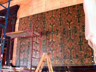

4. stripping: two full panel heights over lower border


The 60s installation featured a 12” high border on top, three rows of panels each 52” high x 36” wide, and a bottom border of 12” in height, adding up to a total of 180” over a high dado of about 5 feet. However, the fabrication by Lutson would use smaller designs to make up each panel. 
5. full panel, 60s installation
This resulted in many quarter-panels, each of which needed to be trimmed out and assembled to replicate the earlier installation. The border, too, was to be split into two panels, each 12” high x 18” wide, rather than the 60s version of 36” wide x 12” high. This produced a panel count of over 400, each destined to play a part.


Potential movement of the substrate was addressed by specifying marine birch plywood fastened into concrete with plenty of metal countersinking under a wooden block support system. The channels between wood panels would be finished with plywood splines glued in and sanded smooth, and patched and sanded to form a continuous surface.

The specifications for the leather installation took many hours of testing. A low-moisture system was settled on. The birch would be primed with two coats of an acrylic urethane. This would be followed by rigorous sanding with 80 grit and vacuuming. The surface would be topcoated with an acrylic wallcovering primer. A polymuslin (synthetic close-knit lightweight cloth) would be adhered to the wall in large widths. The adhesive would be a strippable machine clay. The polymuslin would then be topcoated with more acrylic wallcovering primer.

Testing showed that a clay and polymuslin lamination system  worked well for stabilizing the leather panels. In other words, each embossed, gilded and painted panel was laminated in the US with a slightly larger piece of polymuslin using minimal amounts of starch/polymer adhesive. The panels were allowed to dry thoroughly. Blotters were interleaved for additional reduction of moisture. Trimming followed.

We found that trimming the leather on large sheets of plate glass with brassbound straightedges, framer’s squares and heavy-duty Olfa knives gave the best results. During testing the expansion and contraction of the leather became a matter of some study. The panels waxed and waned for many reasons: because they were freshly fabricated and painted; because of the lamination (which introduced moisture); and because of the change in climate from France to Boston to New York. As a control test batches were measured down to the 16th and even to the 32nd of an inch. The changes were written down and tabulated.

6. installation at One Madison, 2004

An initial calibration of tape measures was important, because head trimmer Barry Blanchard and I worked at two testing sites some two hundred miles apart with two shipments of leather. By far the most interesting discovery was that expansion and contraction was intrinsic to each small panel of leather and not just a result of  fabrication or lamination. The variation was significant—enough to throw off the installation plan. Clearly, although some pre-trimming was possible, the majority of trimming should take place on site.

For the installation, lasers on various levels of the scaffold were set up; these projected a cross-haired full-wall grid. The quarter and half-panel trim sizes were adjusted as the full panels were completed on the wall. In this way the design was controlled as it moved up and down the wall. There was no tolerance, but there was an escape route. If need be, a panel could be shaved a bit on the wall. This option came in handy.

I should not close without saluting the members of the installation team who helped me carry out this interesting and challenging assignment, all of whom are skilled professional paperhangers: Barry Blanchard, Jim Yates, Eileen Carroll, Lynne Parker, and Anthony Russo. Another essential part of the team, especially in the testing phases, was the leather conservator, Alexandra Allardt.


7. installation at Grand Central, 2005


_____

Alexandra Allardt has a conservation practice in Newport, Rhode Island, Artcare Resources:
http://www.artcareresources.com/

Lutson Goudleder: www.lutson.com

Rijks Museum

“Wrought Leather” by Helen Henderson (House and Garden), 1903.

“The Metropolitan Life Insurance Company”, booklet, 1914:

Photo Credits: 1. “Dragon” pattern, contemporary gilded leather (Lutson Goudleder): courtesy Frederic Poppe; 2. removing ceiling, 2004: courtesy of www.artcareresources.com; 3. centered pattern, 60’s installation: courtesy of WallpaperScholar.Com; 4. stripping: two full panel heights over lower border: courtesy of www.artcareresources.com 5. full panel, 60’s material: courtesy of WallpaperScholar.Com; quarter-panel design, cropped from 60’s material: courtesy of WallpaperScholar.Com; 6. installation at One Madison, 2004: courtesy of WallpaperScholar.Com; 7. installation at Grand Central, 2005: courtesy of WallpaperScholar.Com.


Baca Selengkapnya ....

July Favorites!

Posted by csdferwEHRTJR Minggu, 29 Juli 2012 0 komentar
It's that time again!
Time for me to show you (aka gush) about the products that have stood out to me this month. I've got some new finds, rediscovered loves, and a great tip that has totally helped my skin (and my health) during this past month.  

Check out my video below for the goods and don't forget to tell me what YOUR favorite products were in July!
xoxo,
Tiffany


Baca Selengkapnya ....

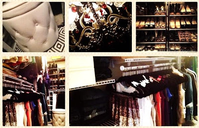
Updated CLOSET TOUR & Organization Tips

Posted by csdferwEHRTJR Rabu, 25 Juli 2012 0 komentar

Call me crazy, but I'm one of those people that are deeply fascinated by closets. Especially other people's.  Considering I started my YouTube channel from our first walk-in at our previous home and filmed in there for a few years, that's probably no surprise to you.


So I'm girly, nosy, and I love closets. Big surprise.


However, I'm also a bit of an organization freak. It calms me to organize things and be in an organized environment. You definitely DO NOT have to spend a fortune on a custom closet to have an organized one.
Check out my video below for a tour of our walk-in at our current home and hopefully pick up some organization tips along the way! ;)

Video FAQ: (basically, where things are from)
-rug: Pier 1 (no longer available....womp womp.)  *Similar one from West Elm, here.
-tufted storage ottoman: Overstock.com
-shoe racks: Container Store
-other little stool: from an antique store
-hangers: Huggable Hangers (or find similar ones from stores like Bed Bath & Beyond and TJ Maxx)
-closet systems: Lowes or Home Depot, customizable closet systems - see the video for more details, not sure of the exacts

Let me know if I left out anything!  Also, what are YOUR biggest closet organization challenges? Any great solutions?

xoxo, 
Tiffany


Baca Selengkapnya ....

NEW Sigma Brow Kit & Brow Grooming/Filling Tutorial

Posted by csdferwEHRTJR Senin, 23 Juli 2012 0 komentar

SO excited that the Sigma Beauty Experts Brow Kit is finally available today! I say "finally" just because I've been using and testing out this kit for over a month now and I absolutely couldn't wait to share it with you all. 
I've been using it often and it now has it's own little special place on my vanity top.

*Be warned.. I've been using and loving this kit for a month, so you're going to see my actual "used" kit in the photos. Being real- that's just how it is.

I know... It comes with a CRAZY amount of stuff. Literally everything you'd ever need for perfect eye brows.  What makes this kit unique is that it not only includes full-sized products to fill and make your brows look perfect, but it also includes all the tools you need to actually groom and shape your brows.
Double-sided highlight pencil, double-sided pencil for filling, jumbo sharpener, 5 brow powders, double-sided brow gel, double-sided brow brush (E75 & E80)

scissors, tweezers, 3 brow stencils


Sigma Beauty Experts Brow Kit, $69
Click here for the kit, and be sure to take advantage of the 10% off code "AP2012" good until July 31, 2012.

Also, don't forget to check out my Brow Grooming/Filling Tutorial below


Brow Kit was provided for consideration by Sigma Beauty with no obligations or agreements to review or feature in my videos or my blog.

Baca Selengkapnya ....

What is Relay For Life?

Posted by csdferwEHRTJR Senin, 16 Juli 2012 0 komentar
Cool you tube video from Canada


Baca Selengkapnya ....

Where This Blogger Creates...the Closet of Dreams

Posted by csdferwEHRTJR Jumat, 13 Juli 2012 0 komentar
Hello dear ones,

I have been wanting to share my studio with you FOREVER.  Problem is, it is still in progress (don't ask how long it has been in progress, it's just embarrassing).  However, this year, I did at least get the closet finished.  I call it my Closet of Dreams because it makes me so happy whenever I go in it.  I'm joining in with Karen's Where Bloggers Create party, so without further ado, please come in and have a look around.

The door was an old Victorian front door that we dug out of the dumpster salvaged from a neighbor's renovation project.  I stenciled the "lace curtain" on the window.


Everything a girl could need to create wonderful things is in here, in addition to things that inspire me and bits of art from other people who inspire me.

The modular storage unit is from Michael's.  It felt so good to finally have a place to put all of my supplies-I labelled the drawers and actually can put my hand on whatever I need with a minimum of effort.  LOVE that!


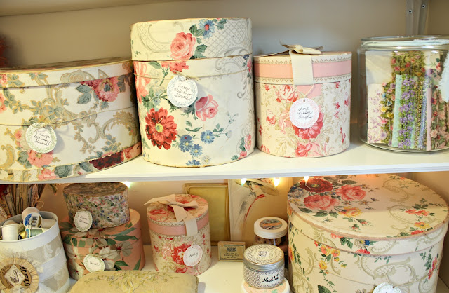
I had great fun making storage containers to hold my bits and bobs.  It's amazing what you can do with peanut butter jars, spice tins, and tin cans when you have a can of white spray paint and lots of pretty papers...

Below are my beautiful lace cards made with oodles of graphics from Karen at the Graphics Fairy.


Storage should be functional, no doubt, but it simply must be pretty if you ask me.


Doesn't everyone have a basketful of doll heads?  And googly doll eyes, don't forget those...I see you!


I love having a place to both use and display pretty things like this awesome antique ribbon embroidered pincushion.


Organized 1920's ribbons-no more digging through boxes and risking damaging the merch.  Swoon...


Make it pretty was my mantra throughout this project...


A shell bowl filled with vintage chandelier crystals shares space with a little ANRI carving that my parents bought when they went to Switzerland.  I brought him home with me after my parents passed away.


Little dollies waiting to be dressed...

Lots of inspiration in this pint sized book.  I loved the cover as well, so it stays out on the shelves.


Vintage tins in pretty colors hold various bits and bobs and yes, the candy lights are up all the time.  Pastel yumminess abounds here.


Little dolls I made a few years back...


Baskets from the thrift store make great storage for my rubber stamps.


A very pretty vintage shoe holder that hasn't quite been filled up yet, but I'm sure it won't take long.


My mermaid reminds me to be who I am...


That's about it for this time.  I hope next time this party rolls around, I can show you the rest of the studio instead of just the closet.

Until next time,

Also partying at:
Pink Saturday
What's It Wednesday
Home Sweet Home
Fridays Unfolded
Feathered Nest Friday
Vintage Inspiration Friday
Simple and Sweet Friday
Shabbilicious Friday
Rustic Restorations Weekend
Make it Pretty Monday

Baca Selengkapnya ....

Standard Operating Procedures: Paperhanging in Historic Homes

Posted by csdferwEHRTJR 0 komentar


A WALLPAPER CASE STUDY BY ROBERT M. KELLY


Paperhanging is a mixture of old and new. Today’s wallpaper, despite different inks and printing methods, would probably be immediately recognizable and pose no great challenge for past generations of paperhangers. And when we consider the mainstays of a hundred years ago — shears, bristle brushes and wheat paste — we realize that these mainstays still work, and that most paperhangers are comfortable using them. Today’s paperhangers could no doubt hang yesterday’s paper, even if some adjustments would need to be made.

Yet tools, materials, and wall surfaces have changed. The housing market of today may be overpopulated with “cardboard boxes,” but it’s a fact that many homes built after 1920 or so have drywall, and that some of them have been deemed “historic.” Premixed adhesives are now standard and acrylic primers have replaced glue size. The adoption of pasting machines and handheld lasers have quickened the pace.

I’ve written a bibliographic essay about historic paperhanging techniques. It gives context for how paperhanging styles have changed, and lists some texts for further study. Styles matter a great deal in paperhanging. An installation of a reproduction wallpaper in a historic home should reflect the styles and handiwork and trade conventions of the time in which it was originally hung, not our own.

The aim of this article is more practical. It seeks to strike a balance between the old and new, and to answer three questions which are not related to style:

1. Given that many rooms in historic homes are prepared and papered each year, how should this be done?

2. How does this differ from other professional paperhanging work?

3. How can managers and curators of historic homes understand and facilitate such work?

What follows is a guide to the standard operating procedures. Some papers, styles, conditions or wall spaces will pose challenges not answered here. Sometimes there is no authoritative answer, even after exhaustive research. The aim is simply to spell out some of the tested techniques and accepted approaches to this interesting and important work.


a. Hiring A Paperhanger

b. Stripping

c. Wall Prep

d. Lining Paper

e. Trimming

f. Pasting

g. Hanging

h. Other Concerns 


a. Hiring A Paperhanger

It may be helpful to find a Painting and Decorating Contractors of America (PDCA) member, or one who belongs to the National Guild of Professional Paperhangers (NGPP). The PDCA is a trade organization to which companies belong, the NGPP is a professional organization. However, the standards for belonging to these groups don’t guarantee that members have advanced or specialized skills. Another drawback is that both groups are relatively small.

There are different tribes of paperhangers and they range from traveling motel and convention center crews to union members in large cities to high end decorating specialists to residential hangers in towns and rural outposts. Ask around. An emerging phenomenon is that more women have joined the ranks. Some years ago it was determined that the NGPP membership was about 30% female.

After a short list is compiled, take time to interview candidates, show them the proposed work, and ask for input. Topics should include the scope of work, how the work should be done, and with what materials. Collaborations can work, even at the pre-bidding level, because many paperhangers are problem solvers and respond well to challenges. From these discussions a realistic set of specifications can be hashed out and bids can follow.

Specifications developed in this way are likely to match the requirements of the job. At the other extreme is a reliance on specifications from authorities in the field or from manufacturer’s recommendations. These are interpreted and administered by some or all of the following: Architects/General Contractors/ Designers/Subcontractors/Sub-subcontractors, and Project Managers.

There are three problems with this approach: 1. there are very few authorities in the field; 2. boilerplate imposed from afar rarely fits the work at hand (this seems to be particularly true in historic houses); and 3. bidding packages based largely on price and minimum standards are usually won by contractors, not craftspeople.

Because of this last point, the completed project may fit the letter of the law of bidding documents and manufacturer recommendations, yet still fall short of a quality standard.


b. Stripping 

To a large extent, stripping depends on how the previous wallcoverings were installed. Some papers are delightfully easy to strip and need only a tug at a corner. Most are more securely fastened.

If the paper can’t be dry-stripped easily, testing is in order. An efficient method needs to be worked out. Dry removal (mechanical) is preferable because the alternative (wet stripping) can cause fugitive evidence, like traces of waterbased paint and pencil marks, to be washed away. If excessive amounts of water are used during soaking, the runoff might get into cracks and affect lower floors.

Often, a wallpaper’s surface is porous. This can be checked by soaking a small area with a sponge. If the wallpaper changes color, it’s porous. If it’s not porous, it usually takes more than soaking to remove it. In some cases, the top layer is a vinyl laminate which will strip cleanly, leaving a layer which must be saturated. If the top resists moisture (if water beads up and there is no color change) it may be necessary to break the ink film with sandpaper, followed by soaking. A surfactant can be added to the water to help it penetrate. Many liquid concentrates are commercially available.

For soaking of all types the watchword is patience. For long soaks, a commercial surfactant mixed with methyl cellulose paste can be effective. Covering this mixture with plastic prevents it from drying out. In extreme situations, steam machines and handheld abrasive devices may be used — but with caution; wall damage may result. Removing paste residue and washing the walls is always a good idea.

Dry-stripping on plaster commences by slicing into the sidewall with a 4" razor tool against the substrate. Dry-stripping on drywall calls for more caution because the cardboard surface is prone to delaminate. If the plaster or drywall is primed, the danger of damage to the wall is lessened, because primers tend to hold out moisture and protect walls better than unprimed walls. 
While stripping primed walls, remember to watch out for clues to earlier work. Traces of previous wallpaper patterns or decorative paint schemes, old window and door placements, shadow lines where long-missing architectural elements once rested and even significant nail and screw holes — all of these have come to light after the stripping of a papered wall. 


c. Wall Prep

If repairs are needed, it’s best to match like to like: plaster repairs for plaster, joint compound for sheetrock. It’s alarming how often joint compound and related soft fillers are confused with plaster and spackle — even in historic homes. Almost all fillers are white in the dry state, but the resemblance stops there.

The older fillers are often denser and stronger. Present-day soft fillers need to be sealed and primed so that they’re ready to receive wallpaper. This is because wallpapers contract as they dry, and may rupture fillers and paint films if the underlying bonds are not adequate. Before application of primer or size, the walls should be bladed smooth with broadknives, sandpapered where necessary, and all grit removed. #80 is a good all-around grit for this purpose.

Recently, masonry-type acrylics (consolidants) have been introduced to the paperhanging field and are effective for many types of paper consolidation; for example, when top layers of sheetrock have delaminated. With some caution, they can also be used to seal so-called builder’s flat (poorly bound paint). However, alkyd primers are still the standard for consolidating flaky, sandy or gritty walls, and for isolating them from successive layers of pasted liner and finish paper. Alkyd is superior to acrylic because the resulting isolating coat is thicker, sands easier, and is more resistant to moisture.

If an alkyd primer is used, a further step is required. This is largely due to VOC regulations, which have resulted in new alkyd formulations. It’s best to cover the alkyd primer with an acrylic wallcovering primer to ensure adhesion promotion for the liner to follow.

If the plaster is raw, it should be made ready for wallpaper. Raw plaster is porous and readily drinks up adhesive, which can sabotage the adhesive bond. Plaster needs to be conditioned so that an “adhesive sandwich” is created between wall and liner. Traditionally, this was done with glue size, which was mixed to the appropriate strength.

However, glue sizes have disappeared from hardware shelves. In their places sit a variety of acrylic wallcovering primers. These seal the wall to a greater or lesser degree and yet promote adhesion. They’re different than paint primers, so it’s important to read the labels.

Some are translucent, but many are white and attempt a universal solution. They seek to combine the virtues of opacity, wall-sealing, adhesion promotion, and strippability. Whether these claims can be met for any particular combination of wall surface, adhesive and wallcovering is a good question. It’s a question that is best answered after an evaluation by a professional paperhanger. In any case, if there are concerns about covering up valuable evidence, translucent wallcovering primers are preferable to white ones.

An alternate (if somewhat weird) method for sizing raw plaster is to locate a glue size, available at art supply stores. Artists still use this product to size canvas. Granulated rabbit skin or hide glue is put into a double-boiler in an approximately 1/25 ratio with water and heated. It is then applied with brushes to the wall. Advantages: historically accurate, hides no evidence, completely reversible. Disadvantage: weird.

Woodwork should be protected from dust and paint with low-tack tape and thin plastic sheeting as needed. The floors should be protected with heavy canvas dropcloths or similar. Ladders or scaffolding must not come into contact with woodwork.

All interfaces where woodwork joins walls (the gaps) are usually caulked. Caulking should not be so full as to call attention to itself, nor so lean as to cause unsightly cavities. While caulk cannot always be color matched, a variety of colors are available at most full-service retail outlets.


d. Lining Paper

Lining paper is not well understood. It’s true that a wallpaper can be hung directly on a wide variety of surfaces. However, paper clings to another paper better than it will to anything else. 
Lining paper serves similar functions as a liner for drapes, or the familiar underlayment (the pad) that goes under most carpets. Just as the underlayment gives the carpet a buffer so that the carpet wears better and looks nicer for a longer time, lining paper helps wallpaper by buffering the effects of humidity and moisture. These pass through walls, especially outside walls, to a greater or lesser degree. 

It also helps in the other direction. Ambient humidity, sunlight, blowing air, and even air conditioning can have an effect on the surface of the wallpaper, which contracts and expands slightly because of seasonal or shorter term climate changes. Liner restricts this movement.

Liner also helps during installation because it gives the paperhanger more control over how seams are managed, how quickly they can be rolled, and how the strips dry out. It should be clear from this line of reasoning that a liner should be porous. Again, as in the case of a wall, the porosity needs to be tempered. This is usually done with a paste size, not an acrylic or alkyd primer. These would seal the liner, and rob it of all porosity.

There are two principal types of liner (blankstock and acidfree), but before describing them we should mention two other types: bridging liners and eastern-style papers. Bridging liners are commonly sold at hardware stores and home furnishing centers. Often composed of at least 50% nonwoven or polyester, they can be recognized by their spun fibers and pure white color. They’re not suitable under reproduction wallpaper for several reasons:

1. they resist moisture and don’t provide the necessary porosity for the wallpaper.

2. their spun texture is not smooth enough to allow for setting seams properly.

For these reasons, bridging liner is best reserved for major wall repairs, and for bridging cinderblock walls, thin paneling, and the like.

The objection to eastern-style papers is quite different. These thin papers are very strong and include such types as kozo, okawara, and so-called rice papers, most of which are made of dense plant fibers. These are often used by paper conservators and are excellent papers in general, and yet are not suitable as an underlayment for reproduction wallpaper, as long as both liner and paper go directly on the wall.

The reason is that they are much less porous than western-style liners, which are created on a web, have a grain, and are composed of pulp or cellulose fibers. This construction creates a considerable amount of bulk which helps the western-type liners drink up great amounts of paste. Much less of this capillary action takes place with eastern-style papers.

The same objection cannot be made to the “air space” type of installation where a stretched canvas or other fabric is secured to frames. There have been some interesting experiments carried out with eastern papers used as laminates, sometimes on the back of wallpaper, sometimes on the stretched fabric. The distinction is that these installations are properly part of the art conservation discipline, as opposed to the topics here, which are the standard operating procedures for paperhanging in historic homes.

When it comes to acidfree lining paper, the only distinction that elevates it over blankstock is its longevity. Both types absorb paste, help the paperhanger control the installation, and secure the wallpaper far into the future. Acidfree, compared to blankstock, is simply better paper. As long as it’s in the range of 7.5 – 8.5 pH, it is not subject to the acid deterioration which afflicts blankstock after some 15 or 20 years, causing browning, brittleness and decomposition. In this regard, blankstock is similar to newsprint, and indeed, both are made from mechanical wood pulp.

While 15 years is a long time for a regular decorating cycle,  historic homes aim for a much longer time frame. This is because a change in decoration is unlikely, and because the cost of reproduction wallpaper usually justifies an upgrade to a better quality liner. The same is true any time a “legacy” type installation is considered, for example, a scenic paper that one might want to keep in the family for generations to come. This topic leads into a discussion about canvas, which allows for removal of such large decorations so they can be used elsewhere, but that discussion will not be broached here.

For both blankstock and acidfree lining papers, a weight of anywhere from 90 to 150 gsm is appropriate (most wallpaper ranges from 100 to 120 gsm).


e. Trimming

For most contemporary work, butt seams are thought to be ideal; the less visible the seam, the better it is judged to be. For work in historic houses, different standards come into play. For most of wallpaper history, an overlapped seam was perfectly acceptable. A butt seam did not become the norm in the U. S. until around 1930 or so. But, even this is a general statement; countries differ widely on what was considered “the norm”, and so did regions within countries.

Despite this history, it’s not quite true that the seams of reproduction wallpaper should stand out: after all, in the period, paperhangers were striving for a seam which was not noticeable at first glance. That explains why they used lining paper (sparingly), trimmed carefully, and hung away from the light. By overlapping away from the light, they ensured that the sun would not cast a shadow when it hit the overlap.

Two complications arise: rag and linen-based wallpapers of the distant past were more fabric-like than today's paper; and, recent research suggests that the weight of wallpaper lessened during the 19th century. Both of these help to explain why overlaps were standard for so long: they were simply not that noticeable. Thus, the question of overlapping is not easily settled. Some of the questions to be considered are: How bulky is the reproduction wallpaper? Will the overlaps call attention to themselves in a way that is not historically accurate? Or, will overlapped seams look “right” for the period?

Trimming and overlapping of the wallpapers should follow 18th,19th, or 20th century models; whatever is most appropriate for the house.

When trimming, the ideal is a slightly wavering edge that, while reasonably straight, shows the hand of the workman (or workwoman) as it overlaps the previous strip. The underlap is also important — these often show in a raking light. Early installations (say, before 1800 or so) show larger underlaps and deckle edges. Later ones show more refined (straighter) underlaps. Three-quarters of an inch is a common historic width for an underlap.

Trimming is done by sitting in a chair with the roll cradled at the feet. One hand begins to take up the roll as the other hand trims the selvedge off. This trimming is done to the pattern, or to a pre-determined point. The work is best done with shears, which are usually somewhat heavier and longer than scissors, with dissimilar finger-holes. 


f. Pasting

For pasting, the essential traits are cleanliness and attention to how the paste is spread, especially at edges. Rollers or natural bristle brushes are commonly used. Most reproduction wallpapers are paper-based and therefore highly porous (these notes pertain to paper only). Pasting machines speed the work and may be used as long as they don’t compromise quality.

There are few rules for the strength of the adhesive, because it must be matched to the paper at hand. A common choice is a blend of 50% wheat and 50% cellulose. Both of these powders are high in moisture when mixed, something on the order of 90%. The cellulose contributes flow and helps the paste travel over the paper. The wheat contributes starch, which is tackier and stronger than the cellulose. Wallpapers often need to be pasted twice: the first coat sinks into the pores of the paper, somewhat unevenly, and starts the relaxation and expansion process. The second equalizes the paste film and can be calibrated to what the paper needs — no more, no less.

For water-sensitive inks such as distemper, the paste is not allowed to come into contact with the front of the paper. Distemper types are often pasted full length and brought to the wall with a minimum of folding (booking). For all types, careful folding, carrying, and unfolding at the wall are important. The placement of laser lines and the timing for the installation of each sheet are also important.

The powder types of adhesive already referred to are commercially available, though less so than so-called premix clears, which are the dominant type in most retail outlets. As in the case of “universal” primers, premix clears try to be all things for all types of paper. In this they largely succeed. Many of them are versatile and can hang a wide variety of paper, and can be easily adjusted (thinned) when they’re too heavy.

However, quite a few thin and delicate papers have been damaged through the use of a premix that was too strong or too heavily applied. When it comes to paper, premixes are often unnecessary. If a liner is used, powder adhesives alone can often do the job.

Nevertheless, premixes do have their place in historic houses. First, they can be used almost universally, as covered above. Second, they're very helpful for securing overlaps and borders. Third, many silkscreens have multiple colors, and need additional tack. If the paper has been covered with too much nonporous ink, it begins to behave more like a vinyl than a paper when pasted. Edge curl increases because of differential (the back, which remains paper, is expanding more than the inked front). Because of this, premix clear can be an excellent additive to the powder pastes. Premixes add tack and are good mixers.

Premix clears might even be the only acceptable paste. For example, a wallpaper may be sealed so completely that it cannot be hung with high-moisture, low-tack pastes, even with a liner. Many screenprints answer such a description. If even a premix clear falls short, a clay premix, which is ordinarily used for commercial vinyl, might be called for. In these tough cases, clays are sometimes used as a pre-treatment at seam areas (to increase tack) or, as the primary paste.


g. Hanging

Traditional wallpapers may be printed on soft papers with sensitive inks. If so, they should be installed by pressing the strips against the wall with soft sweeps. In some countries a felt roller is used. If a wallpaper is coated or otherwise more protected, plastic sweeps can be used more freely.

When overlapping strips, the use of guidelines (both horizontal and vertical) from laser levels is highly recommended. Strips which have a wavering, handtrimmed edge can be difficult to hang with chalk or pencil guidelines.

If the wallpaper is washable, seam areas can be sponged lightly after seam rolling, and moisture removed with terrycloth towels or micro-fiber towels. Some re-touching of seams may be necessary, depending on print methods or inks used. Colors used for retouching should be stable and resistant to UV and to color change over time.

A distinction needs to be made between the minor retouching of one or two mismatched items, for example, a twig or a small leaf, and wholesale “improvements” of large amounts of pattern. There are some scenic wallpapers printed from the original blocks in which mismatches abound. No doubt cupping of the blocks over the years has created some distortion, but on the other hand, it’s clear that many of these mismatches must have been apparent when the blocks were new. As such, these mismatches are part of the block printing process — a reminder that wallpaper is not fine art.

In any case, it’s certainly a mistake to improve the match beyond what would have been acceptable in the period. The case is slightly different with Chinese scenics. It seems likely that freehand brush work was more often resorted to (along with appliqué) as a solution. But even here, some mismatches are inevitable. They should not be judged as “flaws.” They, too, are part of the process, as long as the mismatch is not egregious. A reasonable distance from which side-to-side matching may be judged is about 5 to 8 feet.

For Embossed Types: If an embossed wallpaper like Anaglypta is being hung, care should be taken to avoid flattening the embossing, especially at seam areas. Lining paper decreases the amount of pressure needed to make a good join (another advantage of lining paper). Seam rolling, if any is needed, is done by using the edge of a seam roller in a very small path.


h. Other concerns

If historic photos or engravings exist, the paper should be hung according to the historic photos or engravings.

In extreme instances, some embossed papers or flocks will show white edges after dry-trimming. If these would show white on the wall, they should be pre-colored with an appropriate felt-tipped marker prior to hanging.

After installation is complete an installation report should be submitted to the client listing methods and materials used. An inventory should be taken of remaining wallcovering. This report should be filed with at least two departments of the institution, and a copy retained by the installer.

____________________
Photo credit: WallpaperScholar.Com. 
The front door area of Martin Van Buren's retirement home, Lindenwald (Kinderhook, New York), is shown in 1986 just prior to the installation of reproduction wallpapers. The date of construction (1797) is engraved on the door knocker. The house was built by Judge Peter Van Ness and became Van Buren's in 1839; it was much enlarged by Richard Upjohn in 1850. One day around 1800 a teenaged Martin used this door knocker while making his rounds as a law clerk for Francis Sylvester. Supposedly. 


Baca Selengkapnya ....

Sparkle / Glitter Wallpaper

Posted by csdferwEHRTJR 0 komentar
Sorry the picture isn't the best.. but we HAD to share this new wallpaper with you! All glitter and sparkle! How much fun! Call us!


sparkle glitter wallpaper
 
Order samples directly online at
and search "glitter wallpaper"


Baca Selengkapnya ....

Blessed

Posted by csdferwEHRTJR Selasa, 10 Juli 2012 0 komentar
Hello Sweet Friends, 

Thank you so much for all of your kind comments regarding the Waldo Canyon Fire here in Colorado.   I am happy to report that as of this evening, 17 days after it began, the fire is 100% contained.  Almost 350 homes were lost, but almost 2700 were saved in one neighborhood alone.  The firefighters from not only our local area, but from all over the western states, battled in unimaginable conditions but they fought hard and did such a fabulous job to keep this fire from spreading.  It is truly a miracle and watching the community come together in support of the families who were affected and the firefighters that worked so hard was so heartwarming.  It still hurts to see photos like this where entire streets were almost completely destroyed, but our town is strong and we will recover.


One week after the firestorm came over the mountains and into Colorado Springs, the rains began.  We had the most beautiful double full rainbow.  How could you not feel hopeful after seeing something like this.

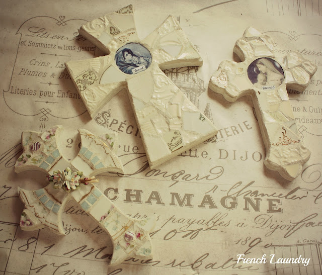
I've been wanting to do some all white crosses for a while now.  My own personal take on the Jeanne d'Arc style, if you will.  After the fire seemed to be getting under control, I just felt like the time had come.  I did a couple all whites (with a little gold) and a very soft shabby chic cross.  I think they turned out lovely and I hope you think so too.  They are headed to the gallery where I have my mosaic work displayed for sale later this week.


On another happy note, I am pleased as punch to let you know that one of my photos was selected for the Miscellany section of the summer edition of Somerset Life.  This is one of the prettiest issues yet and it has features from some of our favorite bloggers, Michelle of Petite Michelle Louise and Susan of Evelyn and Rose.  What a dream come true for me.


Well dear bloggie friends, I see by the old clock on the wall that it is time for this little blogger to go to bed.  I'll be sharing this over at Kathleen's Faded Charm for White Wednesday.  Come by and check out all the dreamy posts for yourself.

Until next time,


Also sharing at:
Shabbylicious Friday
Vintage Inspiration Friday

Baca Selengkapnya ....
Trik SEO Terbaru support Online Shop Baju Wanita - Original design by Bamz | Copyright of wallpaper emo.